July 7, 2026
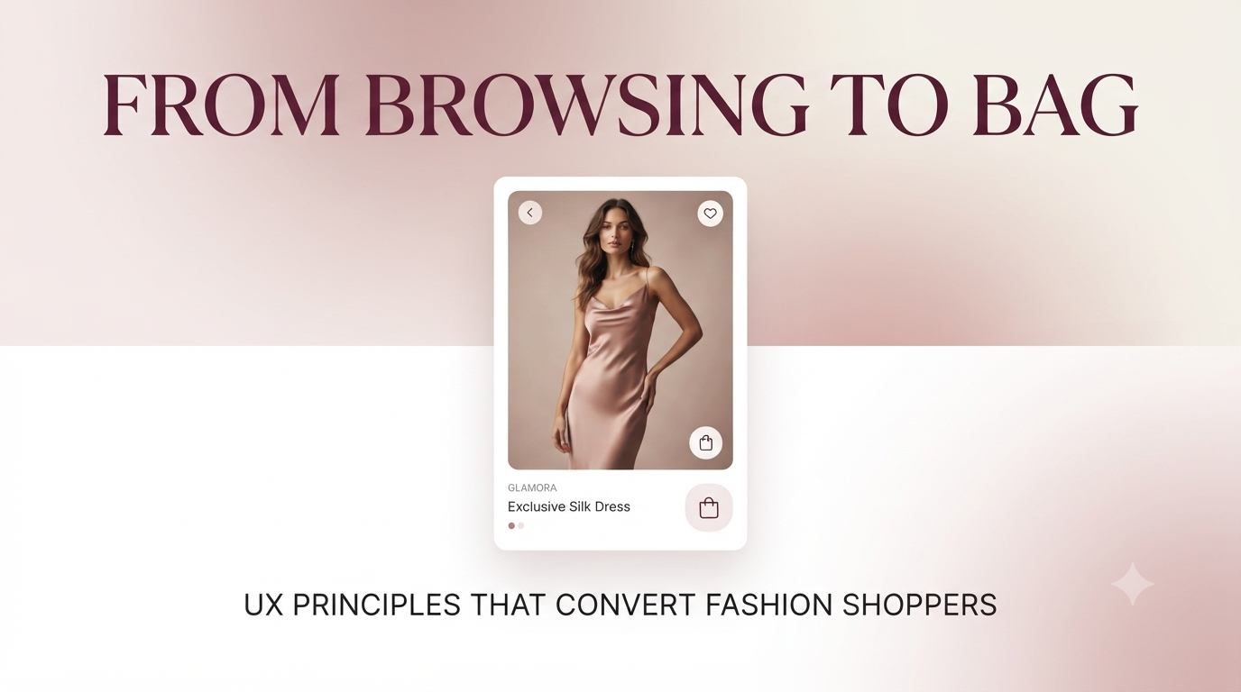
Fashion is emotional. When a user opens a shopping app like GLAMORA, they aren't just looking for clothes they're looking for confidence, identity, and a sense of style. Yet, so many fashion apps fail because they treat the shopping experience like a transactional utility rather than a curated, luxurious journey.
Cluttered layouts, complicated purchase flows, and generic product presentations kill the excitement. A user who feels frustrated or confused will abandon their cart faster than you can say "seasonal sale." Here are the universal UX principles that turn casual browsers into loyal customers.
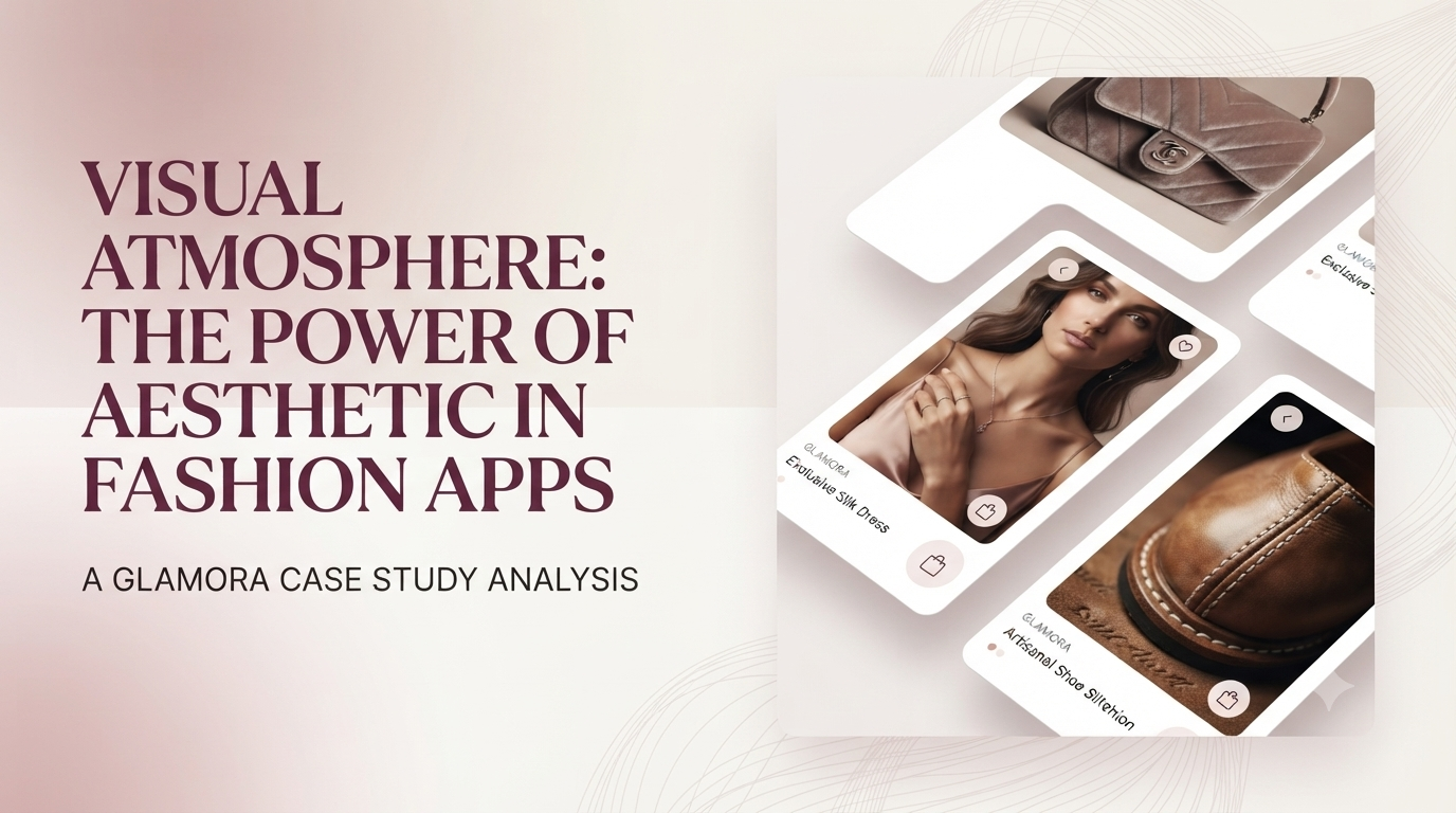
In physical retail, atmosphere matters. Soft lighting, elegant displays, and curated mannequins create a premium shopping experience. In mobile app design, the visual atmosphere does the same heavy lifting.
A soft, muted color palette - think warm nudes, dusty roses, or sophisticated creams - immediately signals elegance and quality. Generous white space gives product imagery room to breathe, making each item feel exclusive and worthy of attention. This isn't just decoration; it's a psychological signal that says: "This brand values quality over quantity."
When users feel like they're browsing a high-end boutique rather than a digital clearance rack, they're more willing to invest - both emotionally and financially.
Fashion shoppers have one goal: find what they love, fast. If a user can't discover a product they like within three taps, they'll leave.
The solution is intuitive categorization and filtering. Categories must be obvious (e.g., "New Arrivals," "Dresses," "Accessories"), and filters should be granular enough to narrow down by size, color, price, and style - but never overwhelming.
Every additional step between discovery and purchase is a potential drop-off point. By reducing unnecessary clicks and simplifying the navigation architecture, the user flows through the app like a well-orchestrated fashion show - effortless, enjoyable, and ultimately rewarding.
A product page is where the sale is won or lost. Too many fashion apps treat it as a data sheet - fabric composition, dimensions, price. But fashion is about identity and aspiration.
High-quality product imagery (ideally with zoom functionality) allows users to appreciate texture and detail. Multiple angles and lifestyle shots (showing the item worn) help users visualize themselves owning the piece. This is particularly critical for mobile, where screen size limits how much a user can see at once.
Pair this with clear, scannable product information - size guides, material details, care instructions—in an organized, bite-sized format. The user should feel informed without feeling overwhelmed.
The biggest abandonment point in any e-commerce app is checkout. The reasons are predictable:
Fashion apps must design checkout to be invisible and frictionless. Guest checkout options, progress indicators, and visual reassurance (trust badges, secure payment icons) reduce anxiety and build confidence. The checkout flow should feel less like a transaction and more like the natural conclusion to an exciting shopping spree.

The brands that win in mobile fashion retail understand one thing: people don't just buy clothes - they buy feeling, identity, and confidence. When the app design mirrors the elegance and excitement of the products it sells, users don't just complete a purchase - they become loyal advocates.
Design for atmosphere, simplify discovery, prioritize emotion over data, and remove every barrier between desire and action. That's the formula for fashion UX that truly converts.