Efficiency by Design: Turning operational chaos into high-converting digital products

Published Date

Introduction

In the modern B2B SaaS landscape, the ultimate competitive advantage isn’t just offering more features—it’s reducing cognitive load. Platforms dealing with workforce management, HR, or staffing often fail not because they lack utility, but because they overwhelm the user.

When designing digital solutions for fast-paced operational ecosystems, a product designer’s role extends far beyond aesthetics. The goal is to align complex system mechanics with frictionless user psychology to drive retention and business growth.

Here are the universal design and business principles required to transform complex data ecosystems into intuitive, premium, and high-converting digital products.

1. The Psychology of Dark UI in Data-Heavy Ecosystems

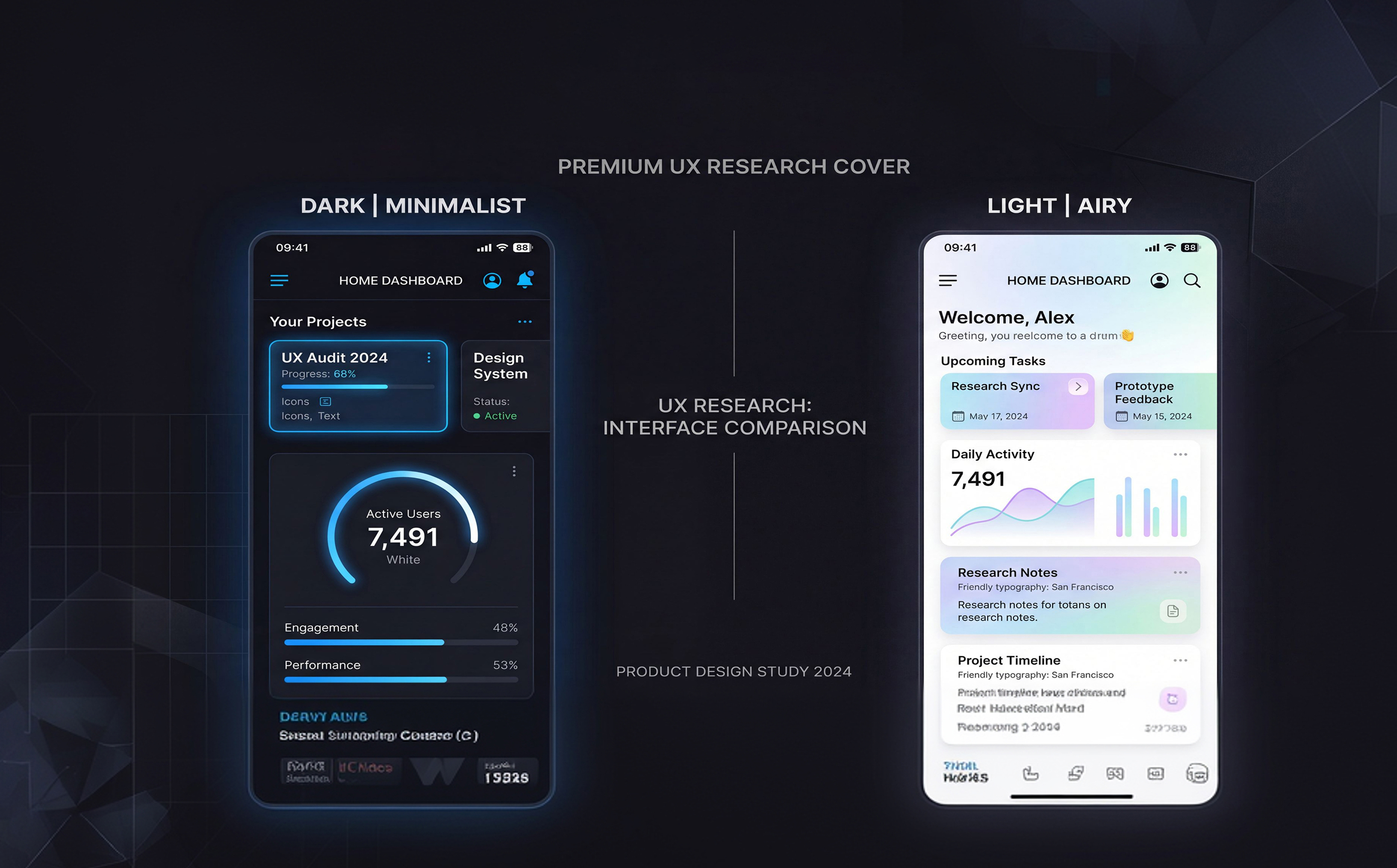
Choosing a visual theme goes beyond surface-level trends; it dictates visual endurance. For enterprise platforms, dashboards, and analytical tools where users spend hours staring at a screen, a dark user interface serves a functional purpose.

  • Reducing Visual Fatigue: Deep, saturated backgrounds (such as the rich slate or dark blues used in premium products) lower data glare. This allows users to manage heavy workflows without suffering from eye strain.
  • Contextual Luminance: In a dark ecosystem, color should never be purely decorative. High-contrast accent colors (like vibrant cyan or electric blue) should be used strictly as functional signals to guide a user’s eye directly to primary actions, interactive elements, and critical notifications.

2. Branding as a Trust Anchor for B2B Platforms

A digital product’s visual identity is its first handshake with an enterprise client. For platforms handling hiring, operations, or sensitive company data, your brand mark must visually communicate reliability, security, and scalability from the first pixel.

  • Geometric Precision: A modern B2B logo shouldn't be overly intricate. Clean, geometric custom typography paired with an abstract, recognizable icon builds immediate authority.
  • Scale and Adaptability: A great product asset works seamlessly across all touchpoints—from a tiny 16x16 browser favicon and a mobile app header to high-resolution investor decks. If a logo’s identity degrades when scaled down, it compromises the professional credibility of the entire platform.

3. Structural Scaffolding: Combating Choice Paralysis with Intentional Typographic Hierarchy

When a user confronts an interface packed with operational data, their immediate instinct is to scan, not read. If everything looks important, nothing is.

  • Geometrics for Clarity: Utilizing a highly legible, clean neo-grotesque sans-serif typeface keeps information feeling modern yet strictly structured.
  • Proportional Scale: Establish an uncompromising typographic hierarchy. Large, bold headlines should anchor the page, while distinct, lower-contrast subheaders and metadata group information logically. By controlling the weight and scale of your typography, you construct a natural reading path that helps users digest dense operational modules without feeling overwhelmed.

4. The Business Value of a Rigid Visual Design System

Designing screen-by-screen is a recipe for technical and visual debt. To build an enterprise product that can scale rapidly without breaking, a unified visual design system is a non-negotiable business asset.

  • Velocity and Consistency: A robust system of reusable components, button states, input fields, and grid alignments ensures that any new feature built in the future instantly inherits the premium look and feel of the original platform.
  • Bridging the Gap to Engineering: When a design system is flawlessly mapped out with clear component tokens, handoff to developers is seamless. This dramatically reduces production bugs, lowers engineering costs, and accelerates time-to-market.

5. Stripping the Friction from Core User Flows

A high-converting product is built on the principle of least effort. Whether a user is onboarding, looking at a workflow pipeline, or assigning tasks, the path from intent to completion must be dead simple.

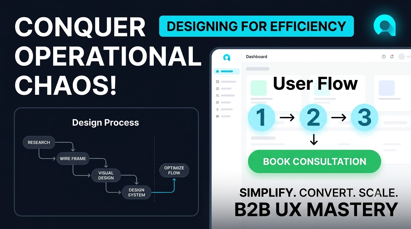
  • Linear Process Maps: Break down multi-step operational tasks into linear, digestible steps. Visual timelines and progress indicators lower abandonment rates by showing the user exactly where they are in a process and what is required next.
  • Optimizing the Value Metrics: Identify the core action that delivers the ultimate "aha!" moment for the business—whether that's viewing a analytics report or booking a consultation call. Ensure the layout naturally funnels user attention toward that specific high-value conversion point.

Moving From Complexity to Clarity

Great product design doesn’t hide complexity; it tames it. By engineering a structured design system, respecting user attention spans through clear typography, and deploying high-contrast functional visuals, you turn a heavy, intimidating utility into a clean, premium tool that users enjoy opening every single day.

How is your current platform tackling workflow friction? If you are looking to audit your digital product’s UX or elevate your interface to a premium standard, let’s connect to discuss how we can drive measurable business growth through design.

Want to optimize your digital product's user experience?

Book a UX Discovery Call