July 6, 2026
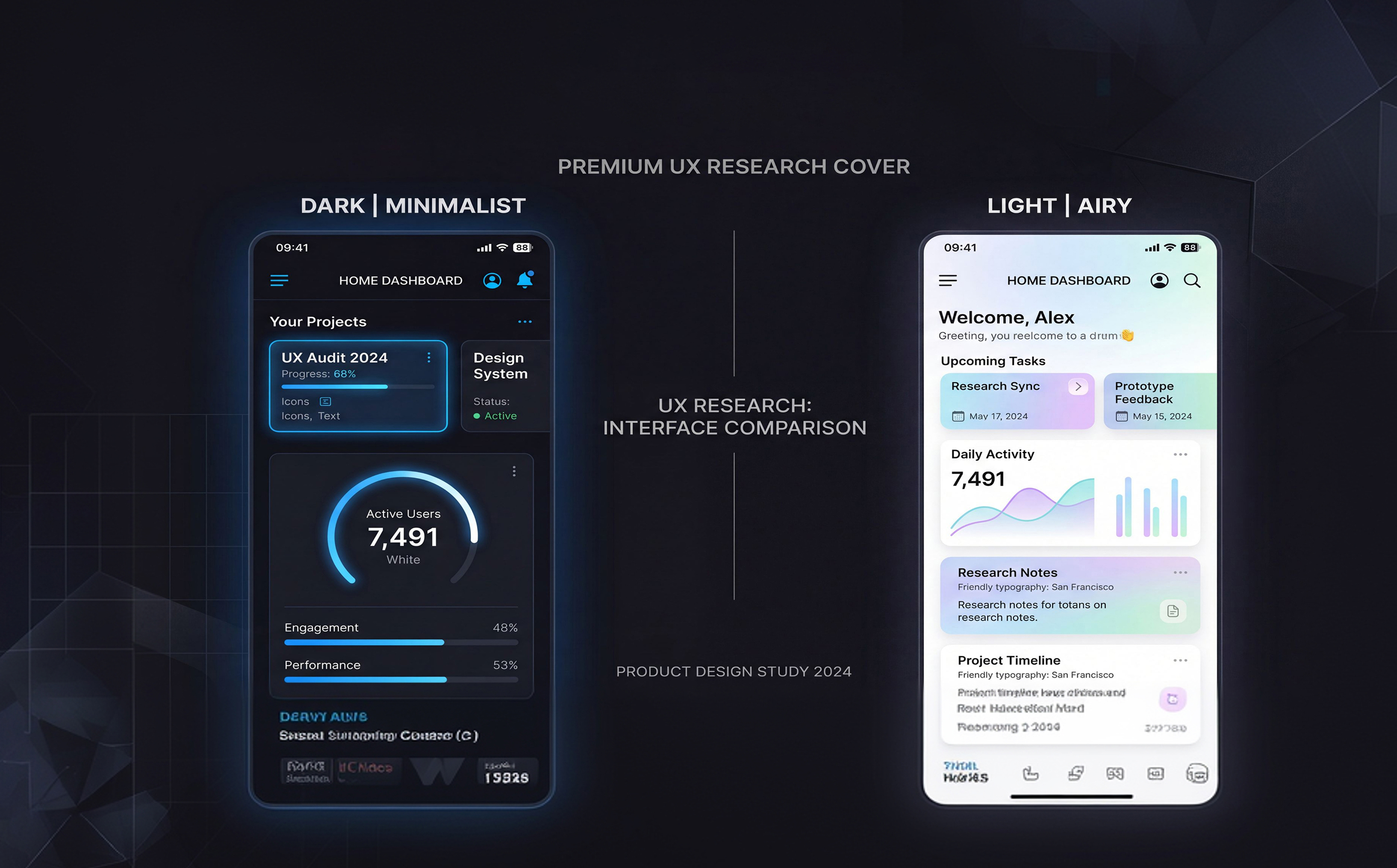
The debate between dark mode and light mode has become one of the most discussed topics in modern interface design. What began as a visual preference has evolved into a significant UX consideration affecting usability, accessibility, readability, user comfort, and even brand perception.
Today, most major digital products offer both themes, allowing users to choose the experience that best fits their environment and preferences. However, the decision goes beyond aesthetics. Different themes influence how users read content, interact with interfaces, and perceive information.
This article explores the strengths and limitations of dark and light modes, analyzes user behavior patterns, and examines how designers can make informed decisions when implementing theme options.
Before comparing the two, it is important to understand their basic characteristics.
Light backgrounds
Dark text
High contrast reading environments
Dark backgrounds
Light text
Reduced screen brightness

Interestingly, early computer systems often used dark backgrounds with bright text.
As graphical user interfaces evolved, light interfaces became dominant because they mirrored printed documents and improved readability.
Today, advancements in display technology have enabled dark mode to become a practical alternative for many users.
Successful theme systems share several characteristics.
Consistency
Both themes should provide equivalent experiences.
Accessibility
Contrast and readability should be carefully tested.
Flexibility
Users should easily switch between themes.
System Integration
Products should respect operating system preferences when possible.
Future Trends
Several trends are shaping the future of interface themes.
Dynamic Themes
Interfaces adapting automatically based on environment and user behavior.
Context-Aware Experiences
Themes changing according to time of day or lighting conditions.
Personalized Visual Systems
AI-driven customization tailored to individual preferences.
Enhanced Accessibility Controls
More granular control over contrast, color schemes, and readability.

The debate between dark mode and light mode is not about determining a universal winner. Both themes provide unique advantages depending on context, environment, and user preferences.
Light mode remains highly effective for readability and content-heavy experiences, while dark mode excels in low-light environments and modern productivity workflows.
The most successful digital products recognize that users are diverse. Rather than choosing one theme over the other, they empower users to select the experience that works best for them.
In modern UX design, flexibility is often more valuable than a single "correct" solution.