July 7, 2026
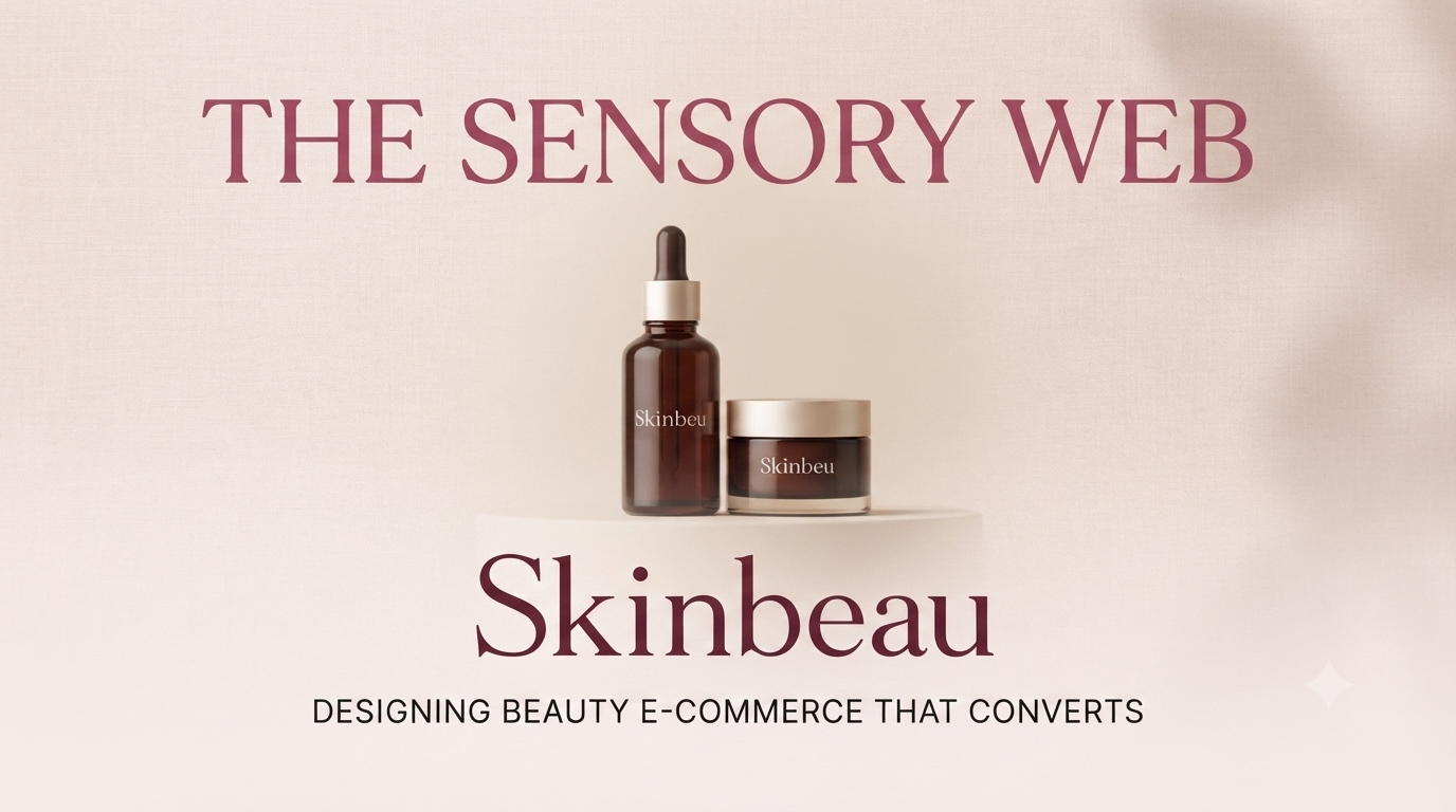
The beauty and skincare industry runs on trust, sensuality, and visible results. When a user lands on a skincare website like SKINBEAU, they aren't just buying a product—they are buying a promise. A promise of better skin, renewed confidence, and a moment of daily self-care.
Unlike software platforms or staffing agencies, skincare is deeply personal and emotional. The interface must feel as pure, effective, and calming as the serums and moisturizers being sold. Here are the core design principles that bridge the gap between digital aesthetics and physical skincare results
Skincare is synonymous with purity. A cluttered, chaotic interface signals the exact opposite of what a user wants to put on their face.
The design must embrace generous white space, clean grid layouts, and a distraction-free environment. When users see a spacious, airy layout, they subconsciously associate it with clean, breathable, and non-toxic ingredients. Every element on the page must earn its place-mirroring the precise, carefully curated formulations of a high-end skincare product. Less really is more.
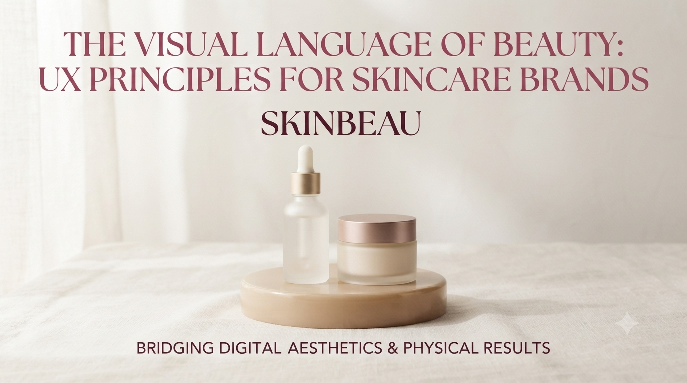
Color does heavy lifting in beauty design.
Typography, too, plays a sensory role. A delicate serif font for the brand name adds elegance and heritage, while a clean, highly legible sans-serif for product descriptions and ingredient lists ensures clarity and transparency. The contrast between elegant branding and functional readability is what turns a browser into a buyer.
Skincare shoppers don't read—they scan for results. The visual hierarchy must guide the user seamlessly from curiosity to conversion:
This invisible roadmap reduces cognitive load and makes the decision to purchase feel effortless.
In a crowded beauty market, if a user can't find the right product for their skin type within 3 clicks, they bounce.
Filters (by skin type, concern, ingredient, or texture) must be intuitive and prominently placed. Product pages should use micro-interactions like hover zoom on textures or color swatch previews to simulate the tactile experience of trying a product in-store. In a post-COVID world, replicating that "touch and feel" digitally is the key to high conversion rates.

Designing for skincare is designing for emotion and biology. A successful beauty website doesn't just showcase products; it creates a serene, trust-filled digital sanctuary that mirrors the transformative promise of the brand. When the design feels as nourishing as the product claims to perform, customers don't just make a purchase they make a commitment.