July 7, 2026
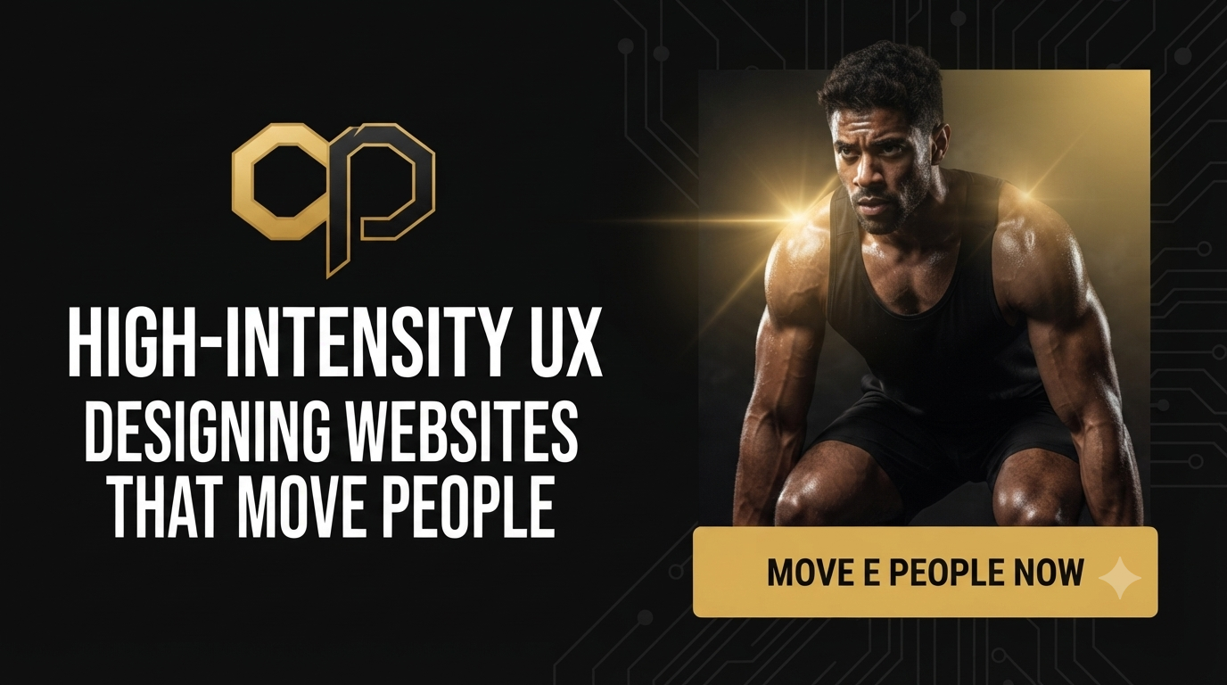
Fitness is 50% physical and 50% mental. A person doesn't just need a workout plan - they need motivation, confidence, and a clear path forward. Yet, so many fitness websites fail because they treat their users like data-entry clerks rather than aspiring athletes. Cluttered layouts, buried service information, and uninspiring visuals kill momentum before a single dumbbell is lifted.
For a brand like CÜPPER PERFORMANCE, the design challenge wasn't just about looking polished. It was about creating a digital experience that mirrors the intensity, structure, and emotional reward of a great workout. Here are the universal principles behind that approach.
Great fitness websites use visual rhythm to keep users engaged - just like a good workout alternates between high-intensity bursts and recovery periods.
The strategic interplay between dark and light sections creates this rhythm. Dark backgrounds communicate strength, intensity, and premium sophistication - similar to the sleek, black-walled interiors of high-end gyms. Light sections, on the other hand, provide breathing room, clarity, and a moment of "recovery" for the eyes.
This alternating pattern does more than look good; it guides the user's scroll naturally. Dark draws attention to bold headlines and key motivators. Light highlights detailed service information and testimonials. The user stays engaged because the page rhythmically shifts between "impact" and "clarity" mirroring the very structure of effective training.
The most common failure in fitness websites is information overload. Users arrive eager to transform their health, only to be greeted by walls of text, confusing navigation, and buried calls-to-action. Frustration sets in, motivation evaporates, and they bounce.
The solution is ruthless simplicity. Service sections must be scannable, not read. Users need to instantly answer four questions:
Every element that doesn't directly answer one of these questions is noise. Eliminate it. A clean, structured presentation removes the friction between desire and action - transforming casual browsers into committed clients.
In fitness, people don't buy squats and push-ups - they buy confidence, energy, and visible results. Static stock photos of people smiling at treadmills don't cut it.
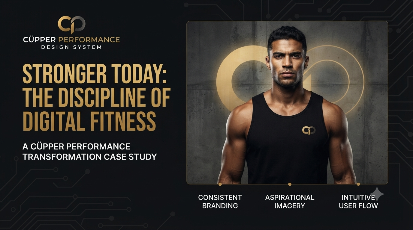
The imagery must be high-energy and aspirational. Dynamic action shots, powerful stances, and authentic moments of effort communicate the emotional payoff of the program faster than any headline. When users see themselves in those images strong, focused, transformed - they begin to trust the brand.
Pairing these images with bold, impactful typography creates a one-two punch: the imagery hooks the emotion, and the typography reinforces the promise.
In fitness branding, typography is a tone-setter. Heavy, bold, and condensed typefaces communicate strength, power, and resilience - attributes every fitness enthusiast aspires to. Using oversized bold headlines for key messages creates an immediate visual impact, stopping the scroll and demanding attention.
However, intensity without clarity is chaos. That's why body text must remain clean, highly legible, and accessible (using a sans-serif or highly readable serif). This combination - bold headlines for motivation, clean text for information—ensures the brand feels formidable yet approachable, intense yet trustworthy.

A fitness website isn't just a brochure - it's the digital front door to a life-changing journey. When the design uses contrast to create rhythm, clarity to remove friction, imagery to sell emotion, and typography to convey strength, it doesn't just inform visitors - it propels them into action.
Great fitness UX doesn't just look good. It moves people.