July 18, 2026
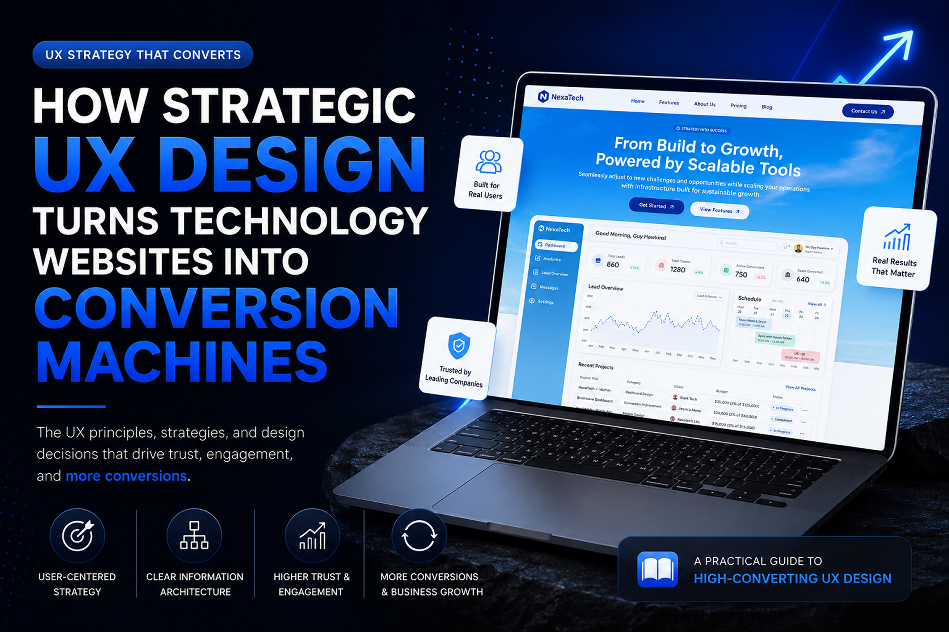
Technology companies invest heavily in their websites. They hire talented designers, purchase premium illustrations, develop polished interfaces, and adopt the latest visual trends. Yet many of these websites struggle to generate qualified leads, communicate value, or convert visitors into customers.
The problem isn't usually the quality of the visuals. It's the absence of a user-centered strategy.
A website can look modern, use attractive animations, and feature impressive graphics while still failing to answer the most important questions visitors ask:
When those questions remain unanswered, users leave—not because the interface was unattractive, but because it didn't reduce uncertainty.
This is where UX Design becomes a business tool rather than a creative discipline.
An effective technology website guides visitors from curiosity to confidence. Every section, interaction, and visual element should reduce friction, clarify information, and support decision-making. Rather than decorating a page, UX organizes content so users understand the product quickly and feel comfortable taking the next step.
The principles explored throughout this article demonstrate how strategic UX transforms technology websites into powerful business assets. Instead of focusing solely on aesthetics, we'll examine the design decisions that improve usability, increase trust, and ultimately drive higher conversions.
One of the biggest mistakes in website design is starting with colors, typography, or layout before understanding the business itself.
Good UX begins long before the first wireframe.
Every successful technology website starts by answering four essential questions:
Without clear answers, even the most visually impressive website becomes little more than digital decoration.
Technology products often serve multiple audiences.
A SaaS platform, for example, may need to appeal to:
Each audience arrives with different expectations.
A founder wants ROI.
A developer wants technical capabilities.
A marketing manager wants ease of use.
An enterprise buyer wants reliability and security.
Understanding these motivations helps prioritize content rather than presenting everything equally.
Instead of asking,
"What should we show?"
UX asks,
"What does the visitor need at this moment?"
That small shift changes everything.
A website exists to accomplish business objectives.
Those objectives might include:
Every section should contribute toward one of those goals.
If an element doesn't help users understand, trust, or convert, it probably doesn't belong on the page.
This strategic thinking prevents unnecessary clutter while creating a much stronger experience.
Technology companies often have dozens of features.
The instinct is to showcase everything.
Ironically, showing everything usually communicates nothing.
Users rarely read websites from top to bottom.
Research consistently shows that visitors scan pages, looking for keywords, headings, visuals, and familiar patterns before deciding whether to continue.
This means information architecture is often more important than visual design.
Instead of presenting features randomly, organize content around user priorities.
A typical hierarchy might be:
Each section naturally answers the next question visitors are likely to ask.
This creates a conversation rather than a collection of unrelated content blocks.
Every decision requires mental effort.
The more choices users face simultaneously, the harder it becomes to choose.
This concept is known as Hick's Law.
Rather than overwhelming visitors with dozens of options, effective websites reveal information progressively.
For example:
Instead of displaying every feature immediately,
introduce the major benefit first,
then allow users to explore additional details only when interested.
This approach keeps pages clean while still supporting deeper exploration.
The hero section is often the first meaningful interaction users have with a company.
Visitors usually decide within a few seconds whether to continue scrolling.
That means the hero must answer three questions immediately:
Many technology websites rely on vague headlines like:
"Powering Innovation"
"Transforming Digital Experiences"
"The Future of Technology"
These statements sound impressive but communicate very little.
Instead, effective headlines describe a tangible outcome.
Users don't buy software.
They buy faster workflows.
Better collaboration.
More revenue.
Less frustration.
The value proposition should communicate that benefit instantly.
A headline creates curiosity.
Supporting text explains the promise.
Rather than listing technical specifications, explain how the product improves everyday work.
Visitors connect more easily with outcomes than features.
The primary CTA deserves the strongest visual emphasis.
Secondary actions should remain available without competing for attention.
This visual hierarchy helps users make confident decisions instead of hesitating.
Too many equally prominent buttons create unnecessary friction.
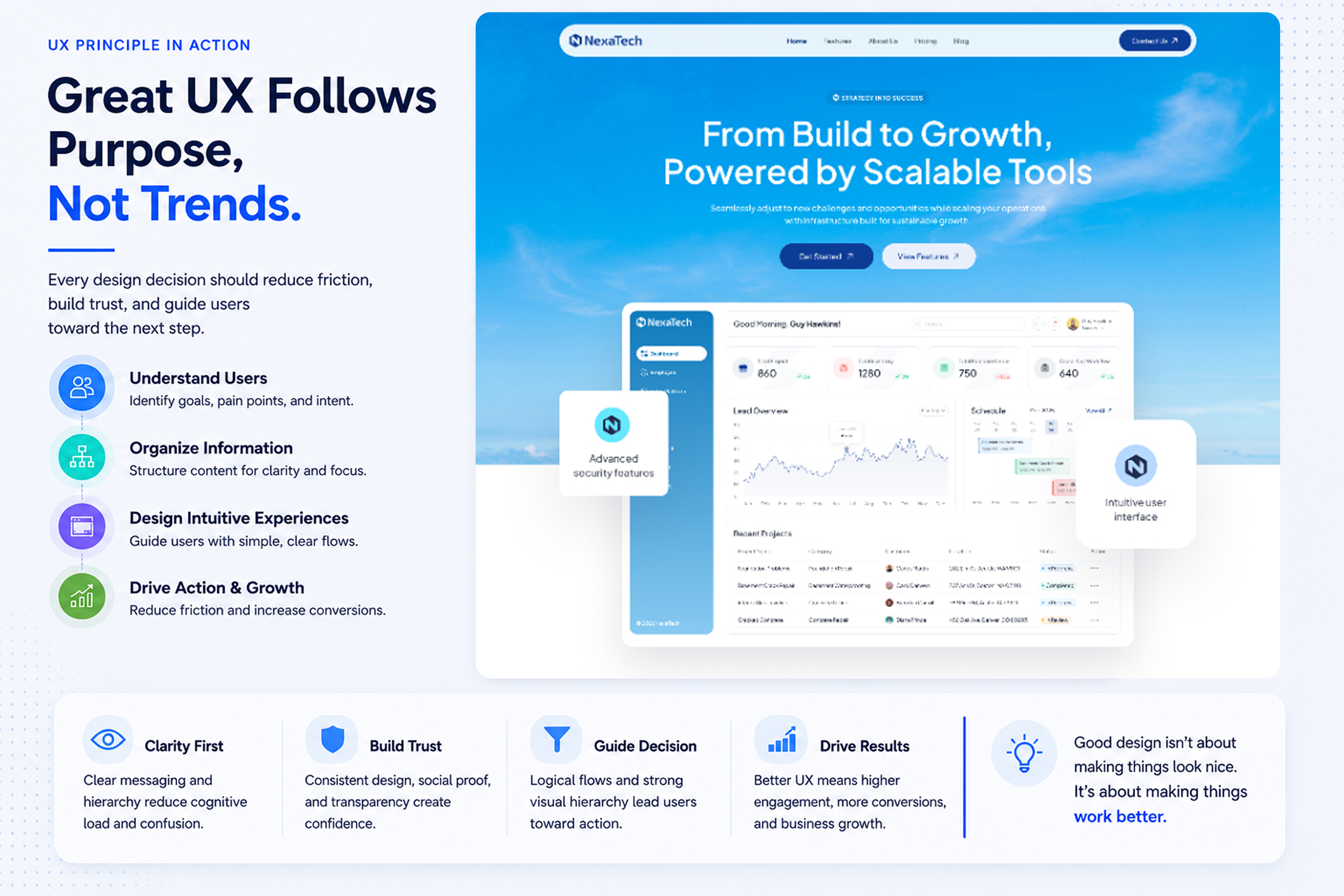
Great user experiences feel effortless.
Not because users think less—but because they never need to wonder what happens next.
Every page should guide visitors naturally toward the next logical action.
Instead of forcing users to think,
the interface should quietly answer questions before they arise.
Each extra click introduces another opportunity for abandonment.
Effective UX reduces unnecessary steps.
Examples include:
Reducing friction increases completion rates because users maintain momentum.
Visitors don't arrive hoping to admire interface design.
They arrive hoping to solve a problem.
Every interaction should support that objective.
Whether downloading a guide,
booking a demo,
or starting a free trial,
the journey should feel obvious.
Confusion is one of the biggest conversion killers.
Visual hierarchy determines what users notice first, second, and third.
Without hierarchy, every element competes equally.
When everything appears important,
nothing actually is.
Typography isn't decoration.
It organizes information.
Effective typography creates rhythm through:
Readable content reduces fatigue and encourages exploration.
Whitespace is often misunderstood as empty space.
In reality,
it separates ideas.
It improves comprehension.
It increases focus.
Crowded interfaces force users to process everything simultaneously.
Generous spacing allows the brain to group related information naturally.
Color works best when used intentionally.
Primary colors emphasize important actions.
Neutral colors support readability.
Accent colors attract attention only where necessary.
Using too many vibrant colors weakens visual hierarchy because every element begins demanding attention.
People don't buy software from companies they don't trust.
Trust isn't established through bold claims.
It's earned through thoughtful design decisions.
A trustworthy website consistently reduces uncertainty by answering questions before users ask them.
Clear messaging, consistent branding, transparent pricing, recognizable client logos, testimonials, product screenshots, and measurable outcomes all contribute to credibility.
Even subtle UI details matter. Consistent spacing, polished interactions, aligned elements, and professional typography communicate attention to detail. Visitors often associate interface quality with product quality. If a website feels unreliable or inconsistent, users may assume the software itself is equally unreliable.
Social proof also plays a critical role. Displaying customer logos, user testimonials, case studies, industry certifications, or usage statistics reassures visitors that others have already placed their trust in the product.
Successful interfaces aren't based on trends—they're based on established principles of human behavior.
Some of the most influential include:
The more choices users have, the longer they take to decide.
Simplifying navigation, limiting primary actions, and progressively revealing information helps users make decisions more confidently.
Frequently used buttons should be large enough to click easily and positioned where users naturally expect them.
Primary CTAs should be visually prominent and easy to reach on both desktop and mobile devices.
Users spend most of their time on other websites.
They expect familiar navigation patterns, recognizable icons, and conventional layouts.
Following common design conventions reduces learning time and builds confidence.
Complex software doesn't need to expose every feature immediately.
Introducing core functionality first allows users to learn naturally without feeling overwhelmed.
Grouping related content, aligning elements consistently, and creating visual relationships improve comprehension while reducing cognitive effort.
Users shouldn't be expected to remember information from previous screens.
Visible labels, intuitive navigation, and contextual guidance reduce memory load and improve usability.
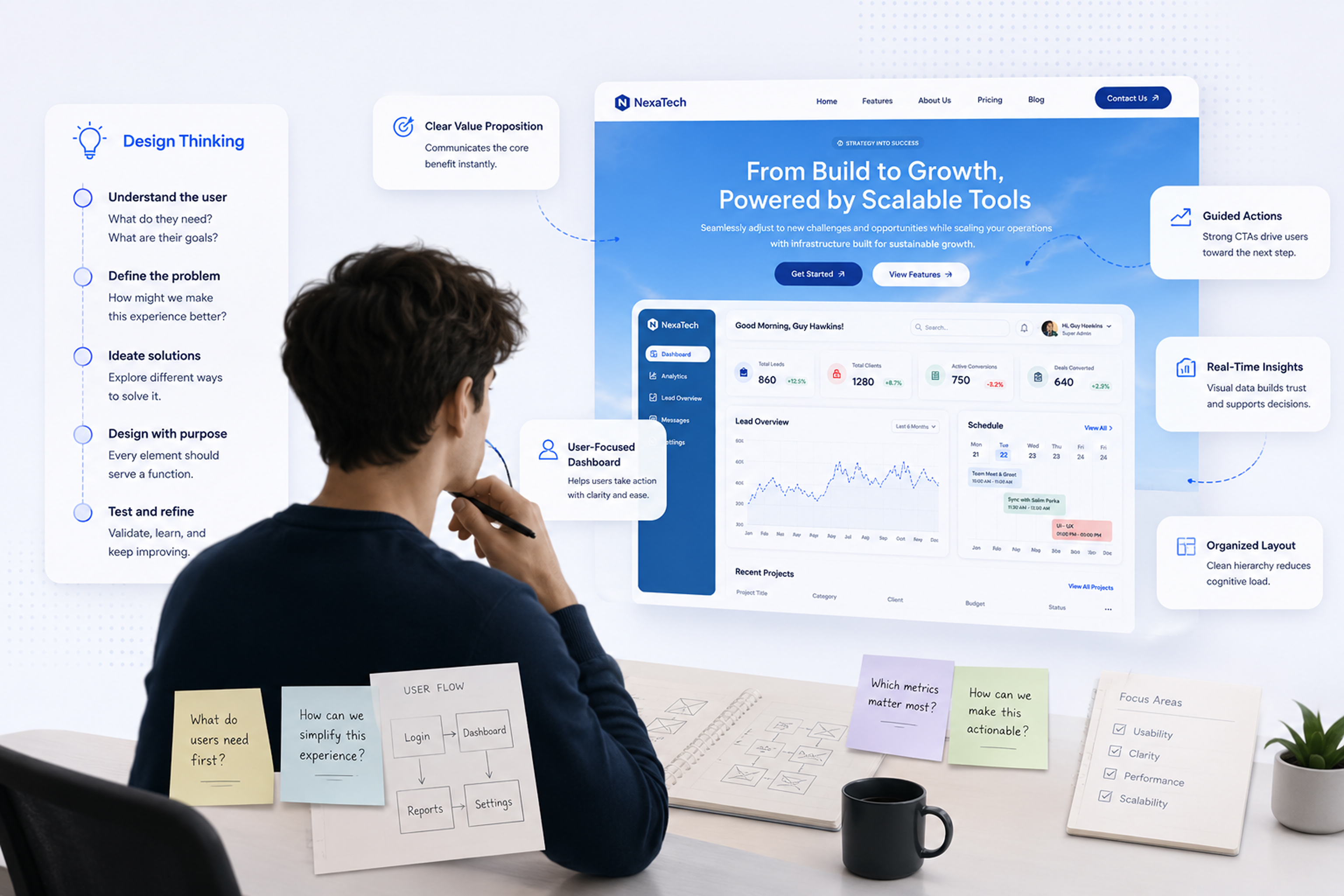
Responsive design isn't simply about making layouts fit smaller screens.
It's about ensuring users can accomplish the same tasks regardless of device.
A mobile visitor often has different goals than a desktop visitor. Mobile users expect speed, larger touch targets, concise content, and streamlined navigation.
Designing mobile-first encourages teams to prioritize the most important content. Limited screen space naturally forces clearer hierarchy and stronger focus.
Flexible grids, responsive typography, scalable images, and adaptive spacing help maintain usability across devices without sacrificing clarity.
Accessibility is frequently misunderstood as a requirement for a small group of users.
In reality, accessible design improves the experience for everyone.
Clear contrast enhances readability outdoors.
Logical heading structures help users scan content.
Keyboard navigation benefits power users.
Larger buttons reduce accidental taps.
Readable typography decreases cognitive effort.
Inclusive design creates better products because it accommodates diverse abilities, devices, and environments.
Accessibility should be integrated from the beginning—not added after development.
Conversion Rate Optimization is often associated with A/B testing, button colors, or persuasive copy.
While these techniques matter, successful conversion begins much earlier.
Visitors convert when they clearly understand:
Every unnecessary distraction reduces confidence.
Every confusing interaction increases abandonment.
The highest-converting technology websites don't pressure users—they guide them.
Many otherwise attractive websites struggle because of avoidable UX mistakes.
Common issues include:
Each of these issues increases friction, making it harder for users to understand the product and move confidently toward conversion.
Before launching your next website, ask yourself:

Exceptional technology websites aren't remembered because they feature the latest design trends—they're remembered because they make complex products feel simple.
Strategic UX transforms websites from digital brochures into business tools. By understanding user intent, organizing information effectively, creating intuitive user flows, establishing trust, and reducing friction, organizations can build experiences that serve both their customers and their business goals.
Ultimately, the most successful websites aren't those with the most animations or the boldest visuals. They're the ones that answer users' questions quickly, guide them confidently, and make every interaction feel effortless.
When UX strategy leads the design process, beautiful interfaces become more than visually appealing—they become meaningful, measurable, and capable of driving real business growth.