July 15, 2026
The healthcare industry has changed dramatically over the last decade. Today, patients don't simply walk into the nearest clinic or pharmacy—they search online first.
Whether someone is looking for a nearby pharmacy, comparing healthcare providers, or searching for medication information, their first impression is often your website.
That means your website is no longer just a digital brochure.
It's your first consultation.
It's your receptionist.
It's your trust-building tool.
Designing an effective medical or pharmacy website requires much more than attractive visuals. It demands empathy, clarity, accessibility, and a deep understanding of how people behave when they're looking for healthcare information—often under stress.
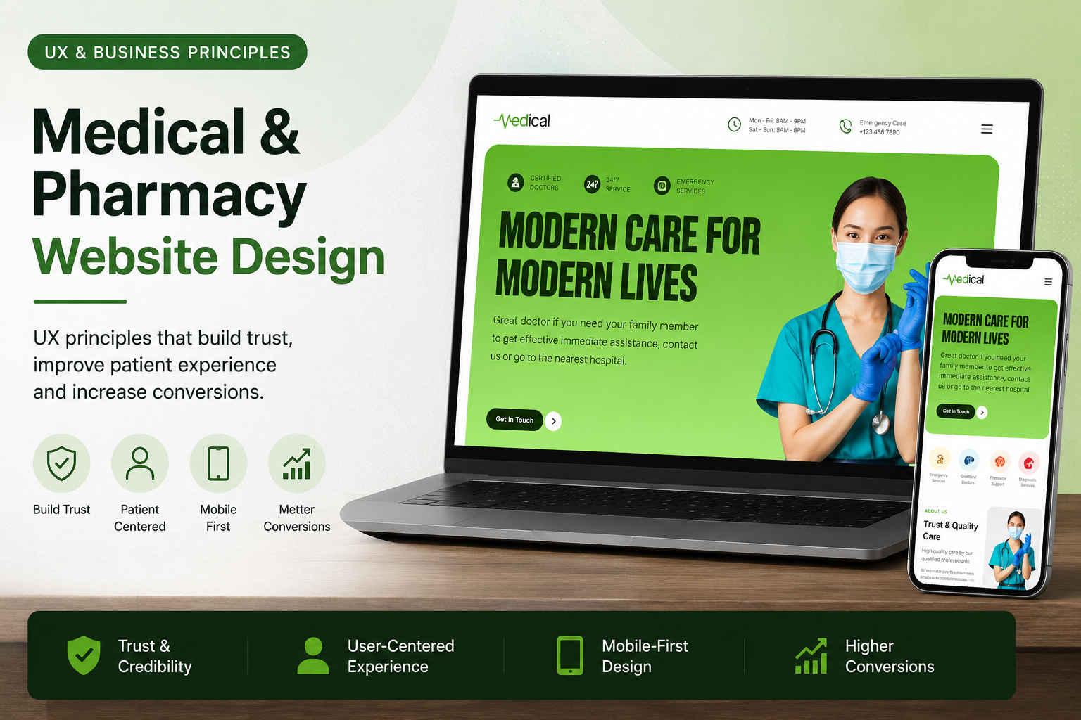
This article explores the universal UX and business principles behind successful healthcare websites, using lessons learned from designing a modern medical and pharmacy platform.
Healthcare websites serve users in emotionally different situations compared to ecommerce or SaaS products.
Visitors may be:
Unlike entertainment or shopping websites, healthcare websites must reduce anxiety rather than increase excitement.
Good healthcare UX creates confidence.
Poor healthcare UX creates uncertainty.
Research consistently highlights that effective medical websites should educate users clearly, guide them toward the next action, reduce friction, and build trust through usability and transparency.
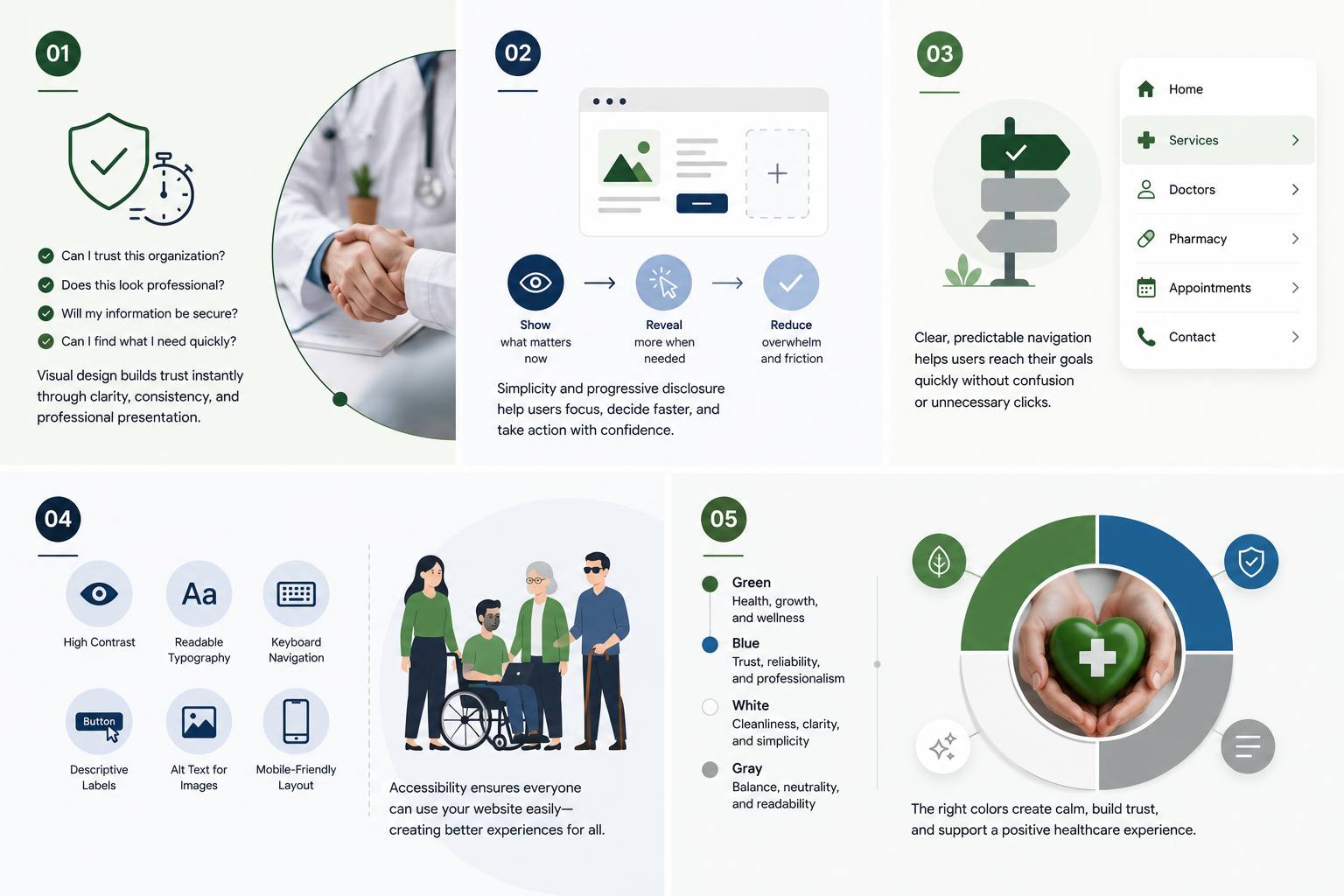
People judge credibility almost instantly.
When someone lands on a medical website, they subconsciously ask:
Visual design plays an enormous role here.
Professional typography, consistent spacing, meaningful imagery, clean layouts, and thoughtful color choices all communicate competence before users read a single sentence.
Healthcare websites don't need flashy animations.
They need visual confidence.
Healthcare information is naturally complex.
The interface shouldn't make it harder.
One of the biggest mistakes in medical website design is trying to present every service, every department, and every piece of information on the homepage.
Instead, successful healthcare UX focuses on progressive disclosure.
Show users only what they need right now.
Then reveal more information when they ask for it.
This approach reduces decision fatigue and helps users complete tasks faster.
People rarely explore healthcare websites for entertainment.
They arrive with a goal.
Usually they want to:
Navigation should support these goals immediately.
Every additional click increases friction.
Simple navigation with clearly labeled categories consistently outperforms complicated mega menus.
Healthcare serves everyone.
Your website should too.
Accessibility isn't simply about compliance.
It's about ensuring every visitor can use your website regardless of age or ability.
Some essential accessibility practices include:
Accessible websites are often easier for every visitor—not just users with disabilities—to navigate successfully.
Color psychology matters in healthcare.
Many successful medical brands rely on:
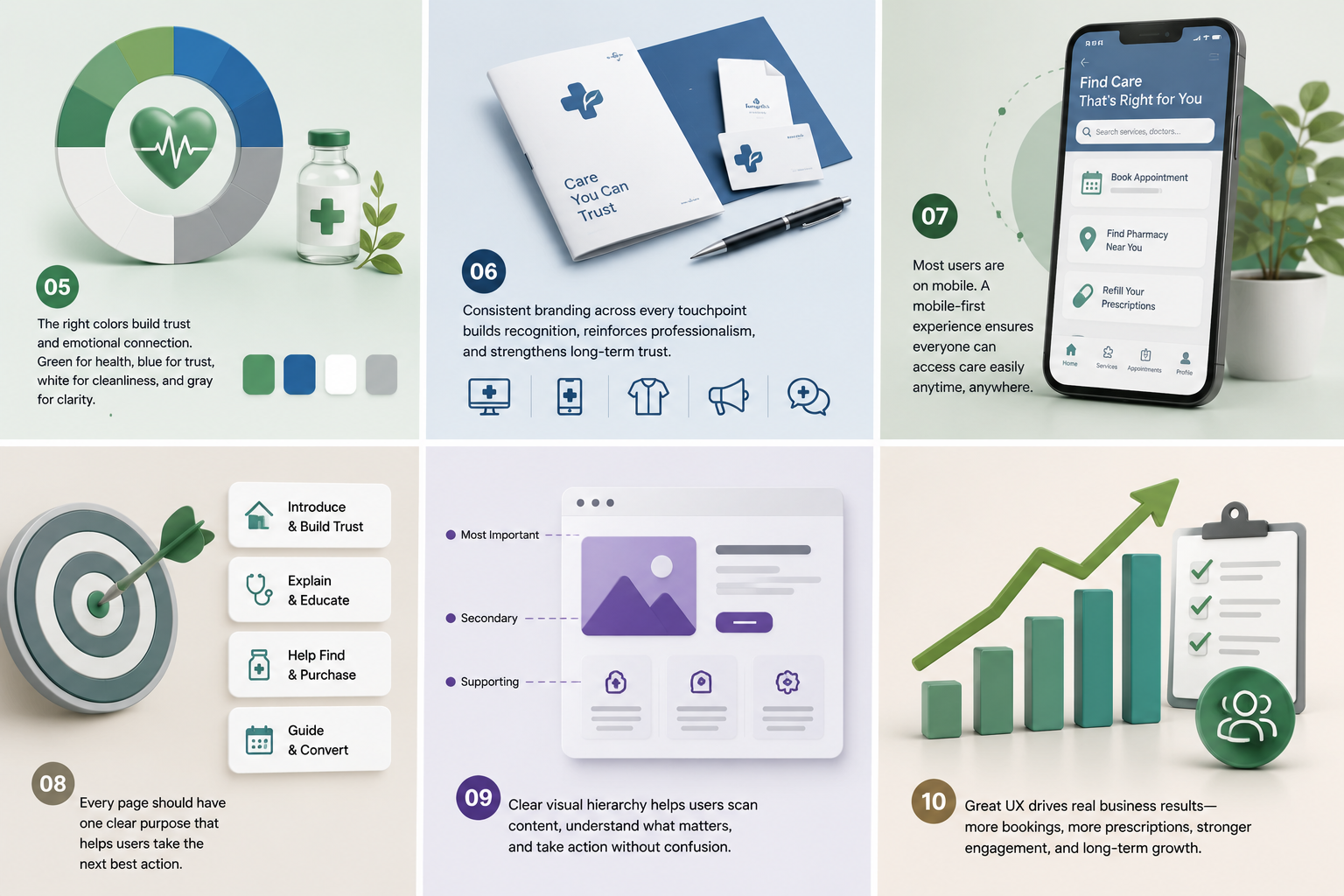
These colors help create calm, reassuring environments instead of overwhelming users.
The goal isn't to make the interface colorful.
The goal is to make users feel safe.
Healthcare brands compete for trust as much as services.
A memorable logo, consistent typography, unified visual language, and cohesive iconography create familiarity over time.
Consistency across:
helps strengthen brand recognition and professionalism.
Most healthcare searches now happen on smartphones.
Patients search while:
If booking appointments or finding medicine becomes difficult on mobile devices, users often abandon the process entirely.
Responsive layouts, larger tap targets, fast-loading pages, and simplified forms significantly improve both user experience and search visibility.
A common UX mistake is designing pages that try to accomplish too many goals.
Instead, every page should answer one primary question.
For example:
Homepage
Services Page
Pharmacy Page
Focused pages consistently perform better because users know exactly what action to take.
Users don't read websites.
They scan.
Good visual hierarchy helps visitors quickly understand:
This is achieved through:
Instead of forcing users to think, good hierarchy naturally guides attention.
Beautiful interfaces alone don't create successful healthcare products.
UX should support measurable business objectives like:
Every design decision should answer one question:
Does this make it easier for users to achieve their goal while helping the business achieve its objectives?
When user needs and business goals align, better outcomes follow.
Healthcare platforms often grow over time.
New services.
New departments.
New specialists.
New patient resources.
Without a consistent design system, maintaining quality becomes increasingly difficult.
A scalable system typically includes:
Design systems reduce inconsistencies while accelerating future product development.
Many healthcare websites still struggle with avoidable usability issues.
Some of the most common include:
Fixing these problems often improves both user satisfaction and conversion rates.
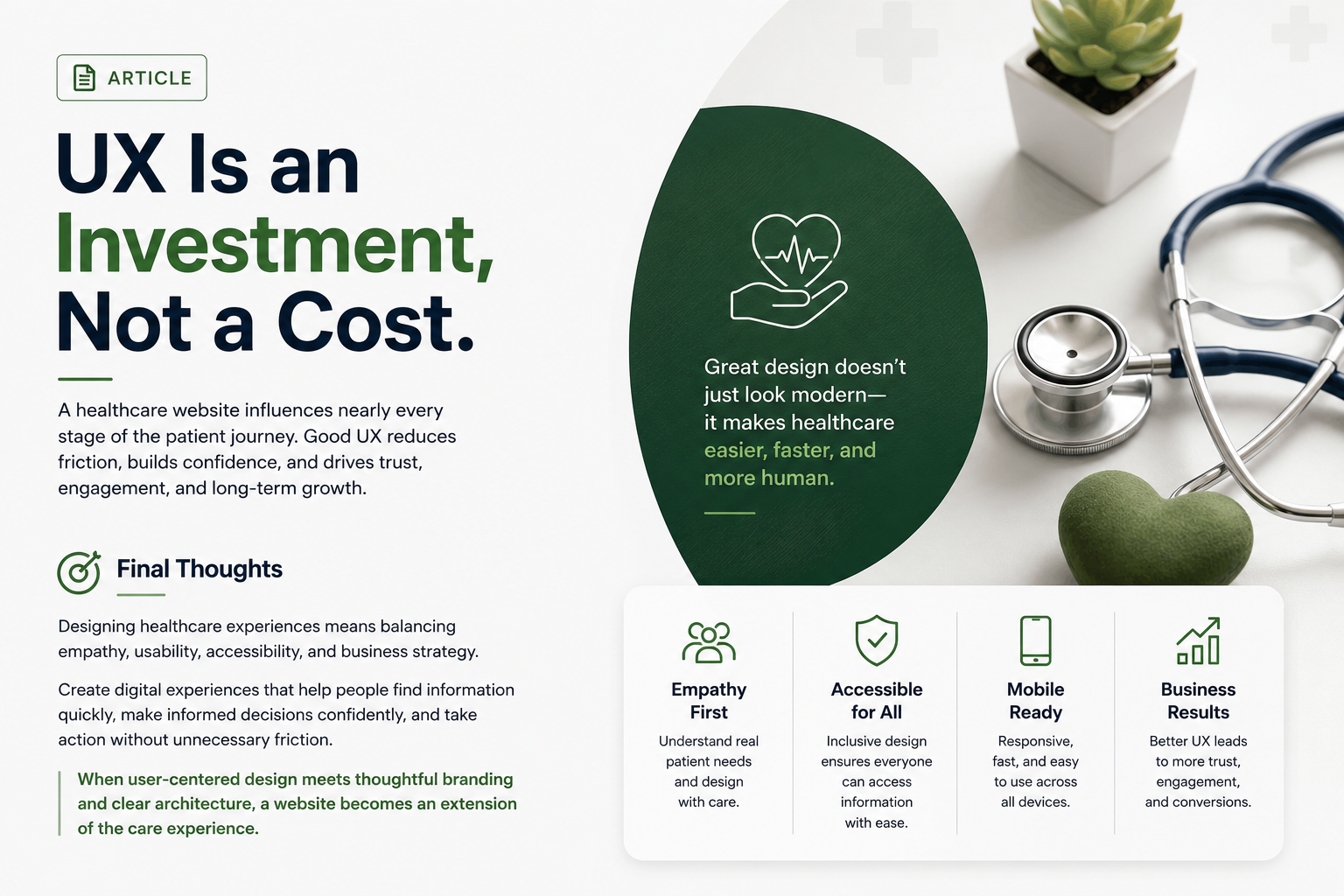
A healthcare website influences nearly every stage of the patient journey.
From discovery to appointment booking, every interaction shapes perception.
Good UX reduces friction.
Good UI builds confidence.
Together they improve trust, engagement, and long-term business performance.
The most successful medical websites don't simply look modern.
They make healthcare feel easier, faster, and more human.
Designing healthcare experiences requires balancing empathy, usability, accessibility, and business strategy.
Whether you're building a website for a pharmacy, private clinic, healthcare startup, or hospital, the objective remains the same:
Create digital experiences that help people find information quickly, make informed decisions confidently, and take action without unnecessary friction.
When user-centered design is combined with thoughtful branding, responsive layouts, and clear information architecture, a healthcare website becomes far more than a marketing asset—it becomes an extension of the care experience itself.