July 7, 2026
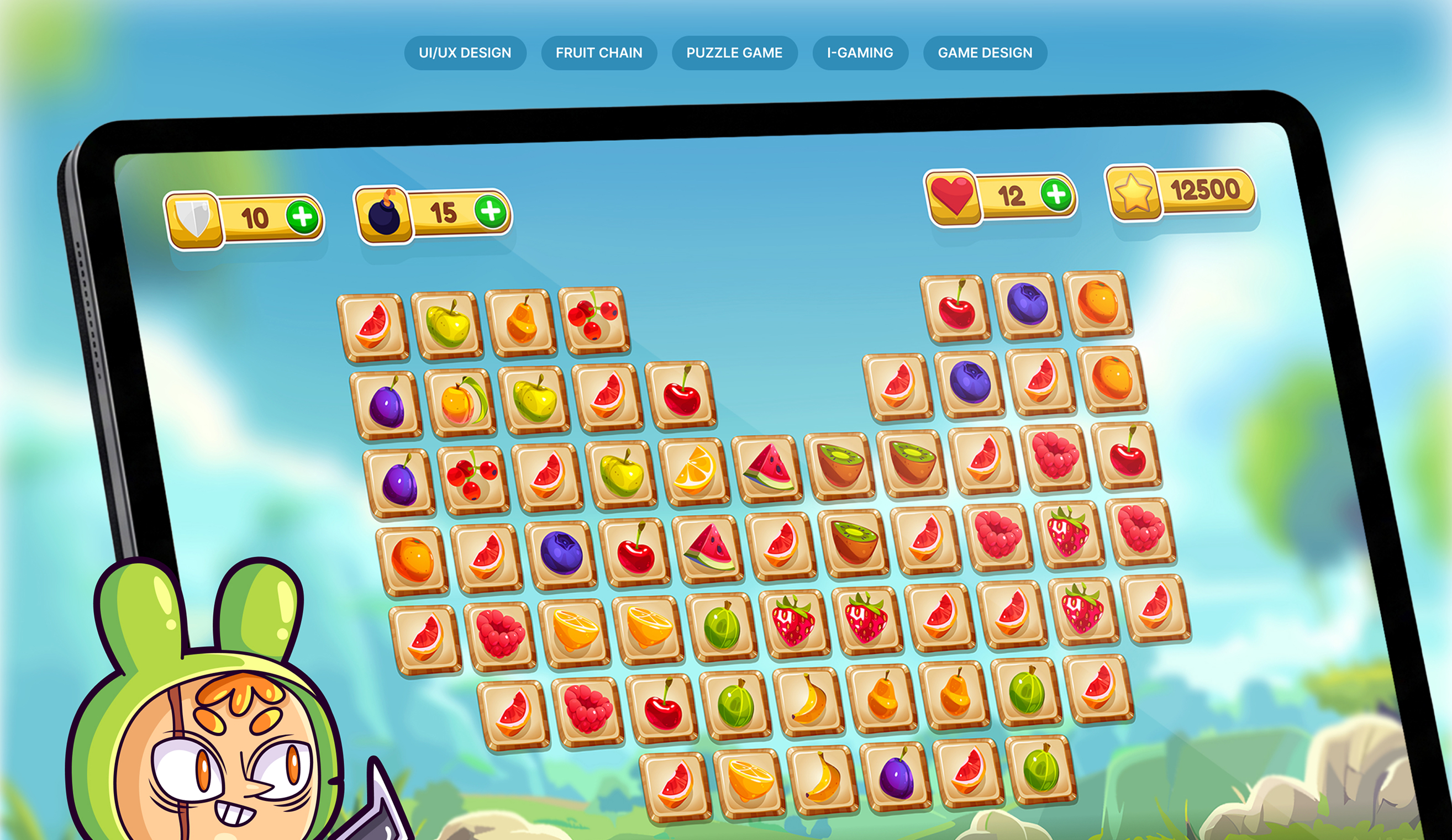
In a native app, you control the screen size. On the web, your game might be played on a 32-inch monitor during someone's lunch break, or on a 10-inch tablet on the couch.
To solve this, I didn't just shrink a mobile design. I built the interface using a mobile-first CSS grid that caps at a maximum width. This means the game board stays perfectly centered and scaled on large screens, while remaining thumb-friendly on smaller browser windows. The goal was to make the browser tab feel like a dedicated gaming device.
In a native app, you control the screen size. On the web, your game might be played on a 32-inch monitor during someone's lunch break, or on a 10-inch tablet on the couch.
To solve this, I didn't just shrink a mobile design. I built the interface using a mobile-first CSS grid that caps at a maximum width. This means the game board stays perfectly centered and scaled on large screens, while remaining thumb-friendly on smaller browser windows. The goal was to make the browser tab feel like a dedicated gaming device.
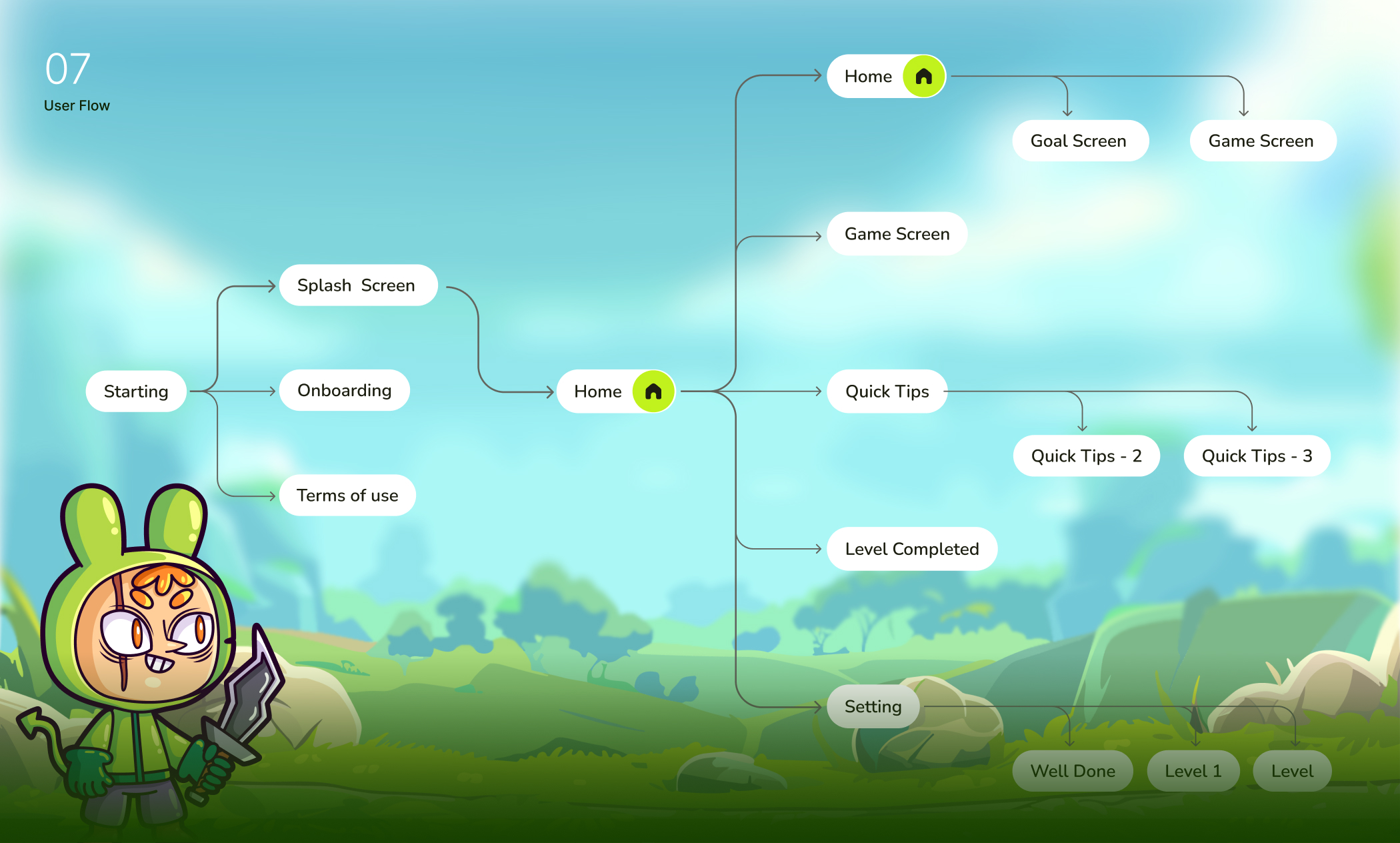
The user flow (Splash → Onboarding → Home → Game Screen) was designed to be fluid for both mouse and finger input.
Instead of relying on heavy swipe gestures (which can feel unnatural with a mouse), I prioritized clear clickable zones and visual feedback (like hover states and subtle scale animations) so desktop users never felt like they were using a poorly ported app. Meanwhile, touch targets remained a minimum of 48px to accommodate thumbs on tablets.
that caps at a maximum width. This means the game board stays perfectly centered and scaled on large screens, while remaining thumb-friendly on smaller browser windows. The goal was to make the browser tab feel like a dedicated gaming device.
Looking at the typography scale (Light, Regular, Medium, SemiBold, Bold), I used weight, not just size, to establish hierarchy.When you resize a browser window, text can break unpredictably. By assigning strict roles—Primary for key actions, Title for levels, Body for instructions, and Lite Text for secondary info - I ensured that even if the font-size scaled down slightly on smaller viewports, the visual structure remained crystal clear.
The biggest win came from the recognizable fruit icons. In a web game, you can't rely on native system fonts or standard UI kits. By using bold, playful illustrations of fruits, I eliminated the need for excessive text labels. Players instantly know a Strawberry from a Grape without reading a single word. This directly addressed the core problem: overwhelming interfaces kill fun. for secondary info - I ensured that even if the font-size scaled down slightly on smaller viewports, the visual structure remained crystal clear.
Building a web game doesn't mean abandoning mobile UX principles. It means adapting them. By respecting the browser's flexibility while enforcing strict visual hierarchies (thanks to a clear color palette and typography system), Fruit Chain delivers a native-like experience without forcing users to hit "Download."