July 9, 2026
In the luxury travel sector, decisions aren't impulsive - they are high-consideration investments. A guest doesn't just "add a yacht to their cart" like a pair of sneakers. They evaluate specifications, visualize experiences, consult companions, and ultimately make a significant financial and emotional commitment.
For a premium brand like BLUEWAVE, the website's job isn't merely to display inventory; it must act as a 24/7 digital concierge - anticipating questions, reducing anxiety, and guiding visitors naturally from curiosity to confidence. Here is how strategic UX architecture makes that happen.
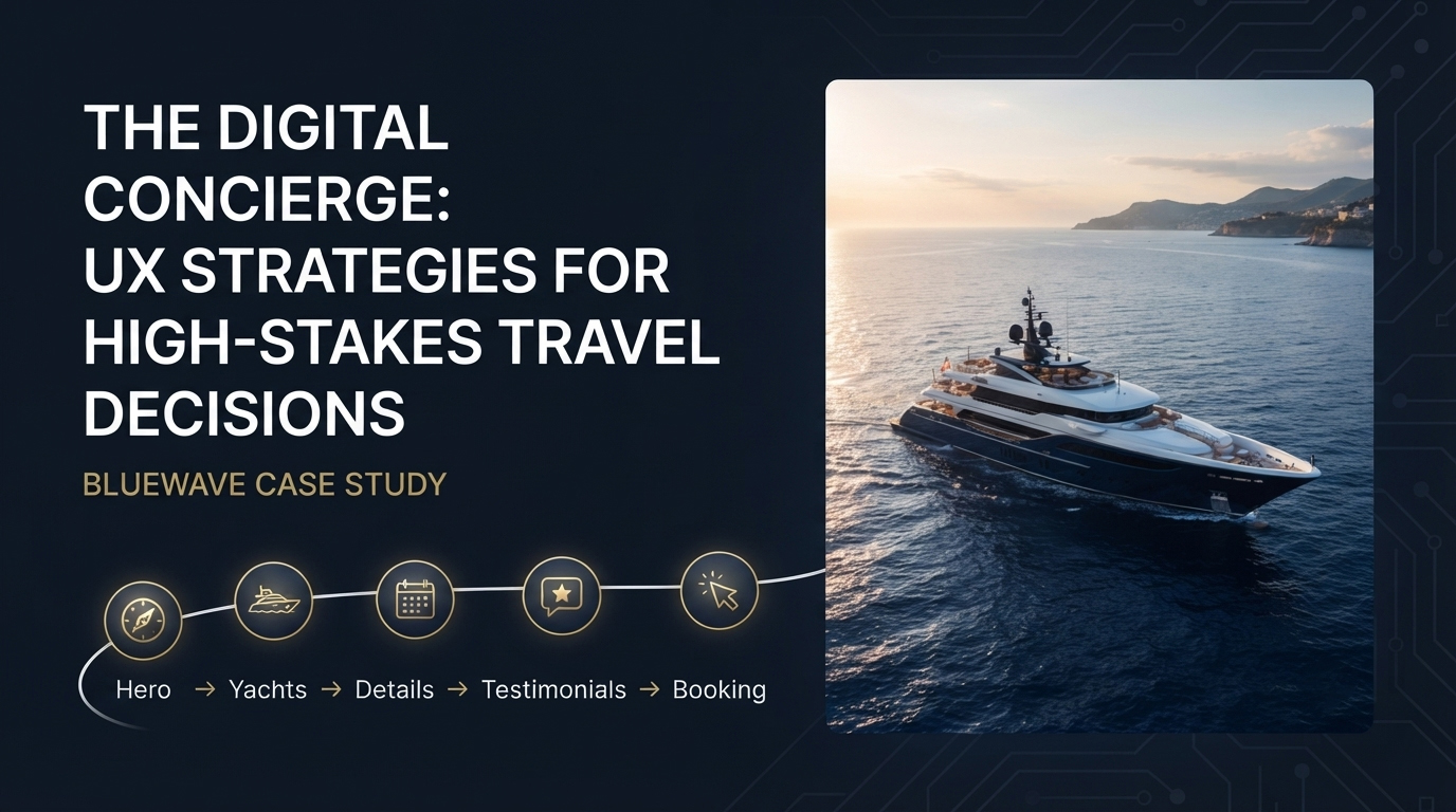
Notice how the user flow is designed to be "simple, intuitive, and conversational". This is the hallmark of great high-stakes UX.
Instead of dropping users into a overwhelming grid of available yachts, the journey begins with an impactful brand introduction (the Hero section). This sets the emotional stage "This is freedom. This is luxury." Only then are users gently guided into yacht listings, service highlights, and social proof.
This structured flow mimics a real-world concierge interaction: greet warmly, understand the vibe, present options, highlight value, and only then ask for the booking. It respects the user's mental state, allowing them to warm up before making a decision rather than shoving a "Book Now" button in their face immediately.

Yachts are complex products. They come with specifications - length, cabins, crew capacity, amenities, itinerary options, pricing tiers. Dumping all this data on a single page creates analysis paralysis, a known killer of conversions.
The design combats this through progressive disclosure: showing only what the user needs at each stage of the journey.
This approach respects the user's cognitive load. It turns a potentially overwhelming data dump into a digestible, even enjoyable, exploration.
There is a psychological shift between "browsing a catalog" and "experiencing a curation." A catalog feels like a warehouse; a curation feels like a personal stylist.
BLUEWAVE’s design emphasizes a curated yacht showcase rather than an endless, filter-heavy list. By presenting a select group of premium vessels upfront, the brand reinforces its exclusivity. It subconsciously tells the user: "We have already filtered out the average options. You are only seeing the best."
This principle is universally applicable to any luxury or high-end brand—whether selling watches, real estate, or fine art. Curation builds value perception instantly.
The case study specifically mentions "connectivity" and "the freedom of ocean travel." Great UX doesn't just show these values; it anchors them into the interface.
The high-contrast, premium yacht imagery acts as a visual anchor, constantly reminding the user of the emotional payoff - the open ocean, the sunset views, the luxurious onboard spaces. The clean layout and balanced compositions ensure that this emotional payoff remains the focal point, rather than getting buried under text or navigation clutter.
When the visual narrative consistently aligns with the user's intrinsic desire (freedom, adventure, prestige), the brand becomes inseparable from those feelings, making the decision to book feel inevitable rather than risky.

High-stakes products require a concierge mindset, not a retail mindset. By structuring the user journey, progressively disclosing complex information, curating rather than overwhelming, and anchoring decision-making in powerful emotional visuals, you transform a daunting purchase into an aspirational experience.
When users feel guided, respected, and inspired, they don't just rent a yacht - they invest in a memory. And that is the ultimate conversion goal.